Kate Spade New York chief creative officer Deborah Lloyd reveals her secrets about mixing and matching different pieces
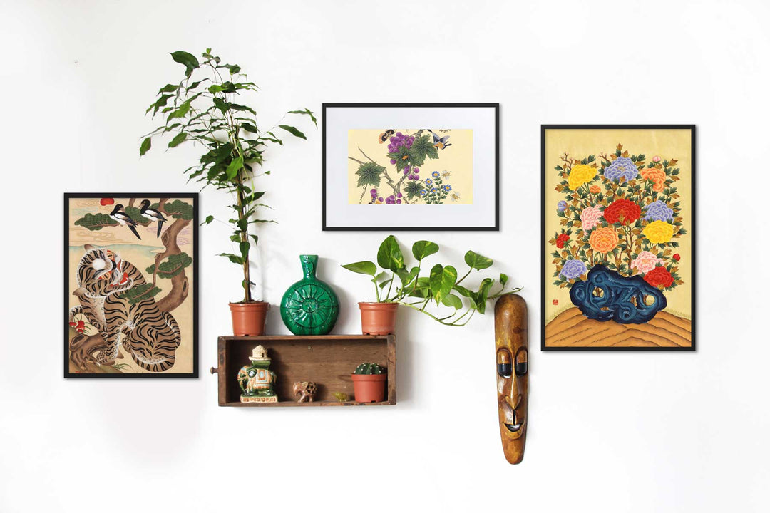
When it's happening on a parlor-like wall, it's difficult to ignore the impulse to stop and take a closer look at every painting, photograph or illustration. Maybe it's because a gallery seems like multiple windows into a homeowner's head. The more informative, the better. "When you buy what you love, you can never go wrong," says Kate Spade, Deborah Lloyd's chief creative officer, and the job just got easier. The fashion retailer has just launched its very first wall decoration collection with Wendover Art Group, which includes more than 70 works. There are funny phrases, old-school theater posters, vivid abstracts, and black and white drawings. The question is: how do you bring all these different designs together in one exhibition? Read on for Lloyd's top tips.
It tells a story
"Wall decorations reflect your personality, personal style and interests," says Lloyd. "It gives others that certain 'it' factor that makes you and your life interesting, and when curated on a parlor wall it should convey that story. Find out what you want to say, and then go for it ! " Each Artworkthe one you choose should fit into your narrative. "I happen to love the mix of an illustration, a painting (oil or watercolor) and a handful of prints that speak to our story: the traditional meets the modern, and always with a twist!
Don't lean too much in one direction
"It's all really a tightrope between harmonizing warm and cool colors, visually heavy and light pieces, and graphic, painterly and photographic work to create a look that is easy on the eyes as a whole," she explains. "The charm of a salon wall is the visual cohesion that is still eclectic and energetic".
Make them as big or small as you want
"More is more! But don't forget that curating a salon wall isn't about numbers, it's about exhibiting pieces that are personal, inspiring and that tell your unique story. Whether that's 5 or 13 pieces is up to you." ! For most of the visual intrigues, however, I personally feel like an odd number of pieces. "
Build from a focal point
"To avoid the mix looking messy (which it often tends to do when you have more smaller pieces than larger pieces), anchor the gallery with at least one impressive piece of work," says Lloyd, "and then sprinkle the rest around, being You can vary the size and orientation for a balanced composition.
The small plus lies in surprising additions
Gallery walls aren't just for traditionally framed Works of art thought. "Add unexpected details by layering everyday items, such as a bright vintage book cover, and leaving them unframed for an added element of playfulness.
recorded and translated by www.architecturaldigest.com


